Displays
Jocca Pharma Counter Display
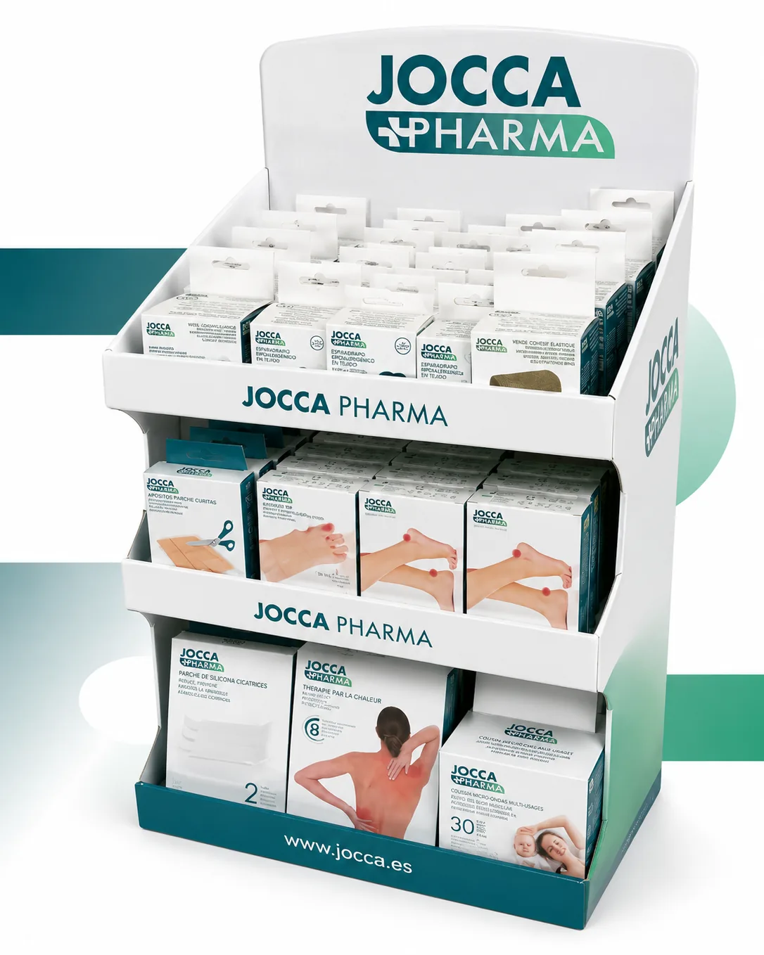
A cardboard counter display for Jocca Pharma's parapharmacy range: three stepped tiers and a hook panel to show the whole range without taking up more counter.
- Client
- Jocca Pharma
- Services
- Structural design, die-cutting, printing
- Year
- 2026
Jocca Pharma — counter display for the pharmacy channel
Jocca Pharma didn't come to us with a technical problem, they came with a space problem. Their parapharmacy range — plasters, tapes, bandages, silicone scar patches, heat therapy — is made of small, quick-decision references that only sell if the customer sees them on the counter. The brief was easy to state and hard to solve: fit the whole range into the slice of counter the pharmacy is willing to give up.
The answer was a cardboard counter display that works upwards. Instead of spreading product across the surface — which is what eats counter space — the piece stacks it in stepped tiers and adds a hook panel at the top. Same footprint on the table, three times the product on show.
The real challenge: capacity per centimetre of counter
On a pharmacy counter, space isn't measured in metres but in negotiated centimetres. Every centimetre the display takes is a centimetre the pharmacist can't use to serve, so the piece has to earn its place through capacity: the more units it holds without growing in plan, the longer it takes to empty and the less often it needs restocking.
The stepped tiers solve that. The three levels are calculated so that each tier doesn't hide the one behind it: the rise is set by the tallest box in the row in front, not by a round number. The customer reads the full face of the range at a glance, and restocking happens from the front, without dismantling anything. The bottom tier takes the large formats — the microwave cushion, the patches — because they occupy the most volume and cope best with being low down; the small ones move up, where they get seen.
Above them, the hook panel uses a zone most counter displays waste: the air between the last tier and the header. That's where the euro-slot blisters go — flat, and needing no depth. It's the part that adds the most capacity at zero cost in footprint.
Brand at three heights
The artwork splits the message into bands, which is how a display is read from a metre away: header with the logo at full size, so the piece is identified from the door; retaining fronts on each shelf carrying the brand, holding the product in place while repeating the name at eye level; and a plinth with the website, on the one band that competes with nothing. Three brand moments without stealing a single slot from the product.
The white ground and the corporate green do the rest: on a pharmacy counter crowded with coloured cartons, white is what lifts the piece out of the noise.
Structure: weight up top, assembly without tools
A display filled to the brim is heavy, and board behaves differently depending on where that load lands. The shelves carry reinforcement under the bearing area and the retaining fronts act as a beam: they hold the product and stop the shelf flexing in the middle. The piece arrives folded flat, slots up in a couple of minutes, and needs no tools or long instructions — in a pharmacy it's assembled by whoever is behind the counter, not by an installer.
Being cardboard, the next campaign changes only the artwork — the structure is already solved — and the piece is recycled when it ends.
Where this format fits
This kind of piece is the standard whenever the range is wide, the product small and the point of sale a counter: pharmacy POS, parapharmacy and orthopaedics. We cover the format in full on our counter displays page.